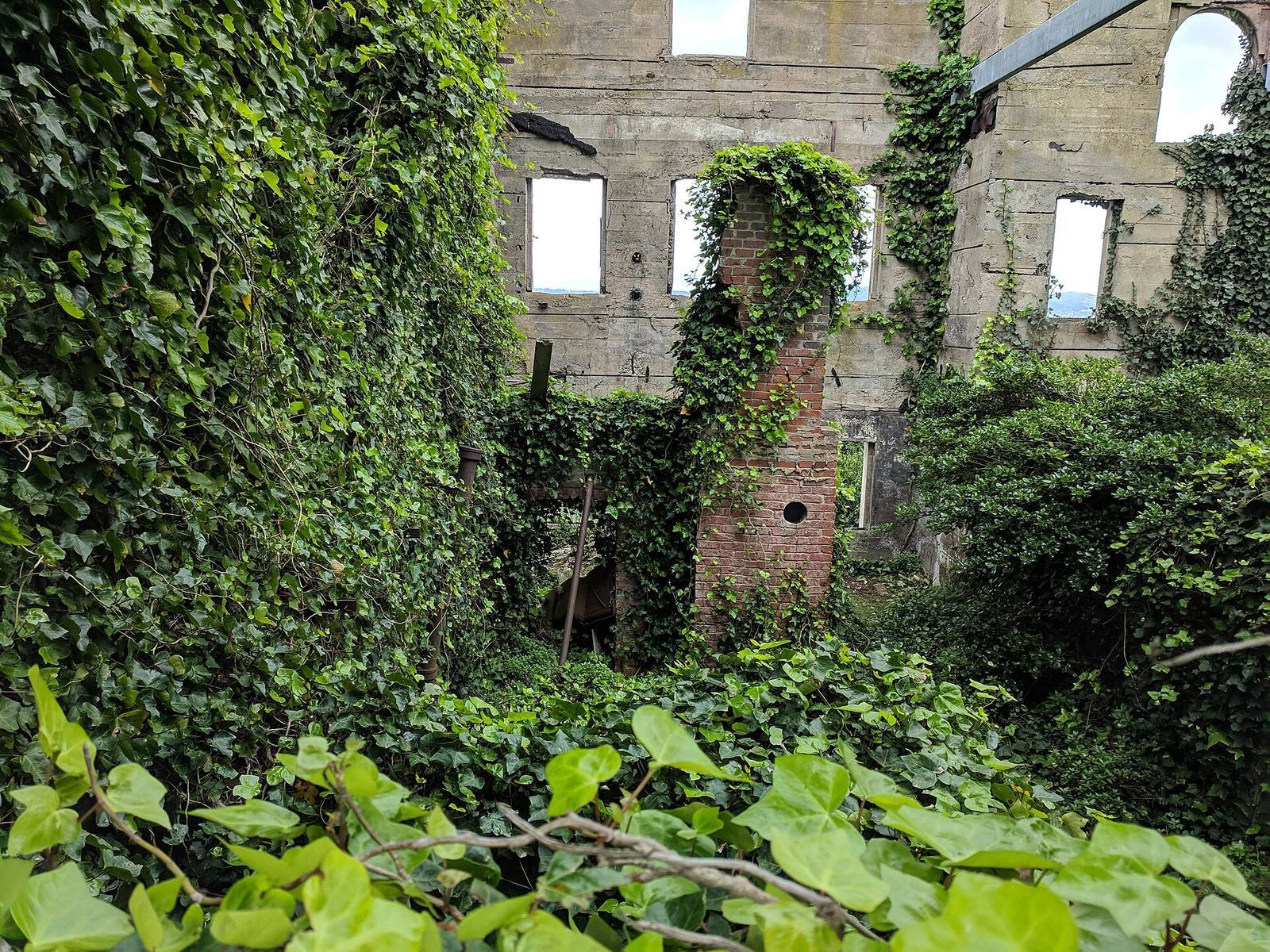
In short: Players follow light, contrast, motion and open space, in roughly that order, long before they read a minimap. Good guidance stacks three or four weak signals on the correct path instead of one loud arrow, so players navigate confidently while crediting their own intuition.
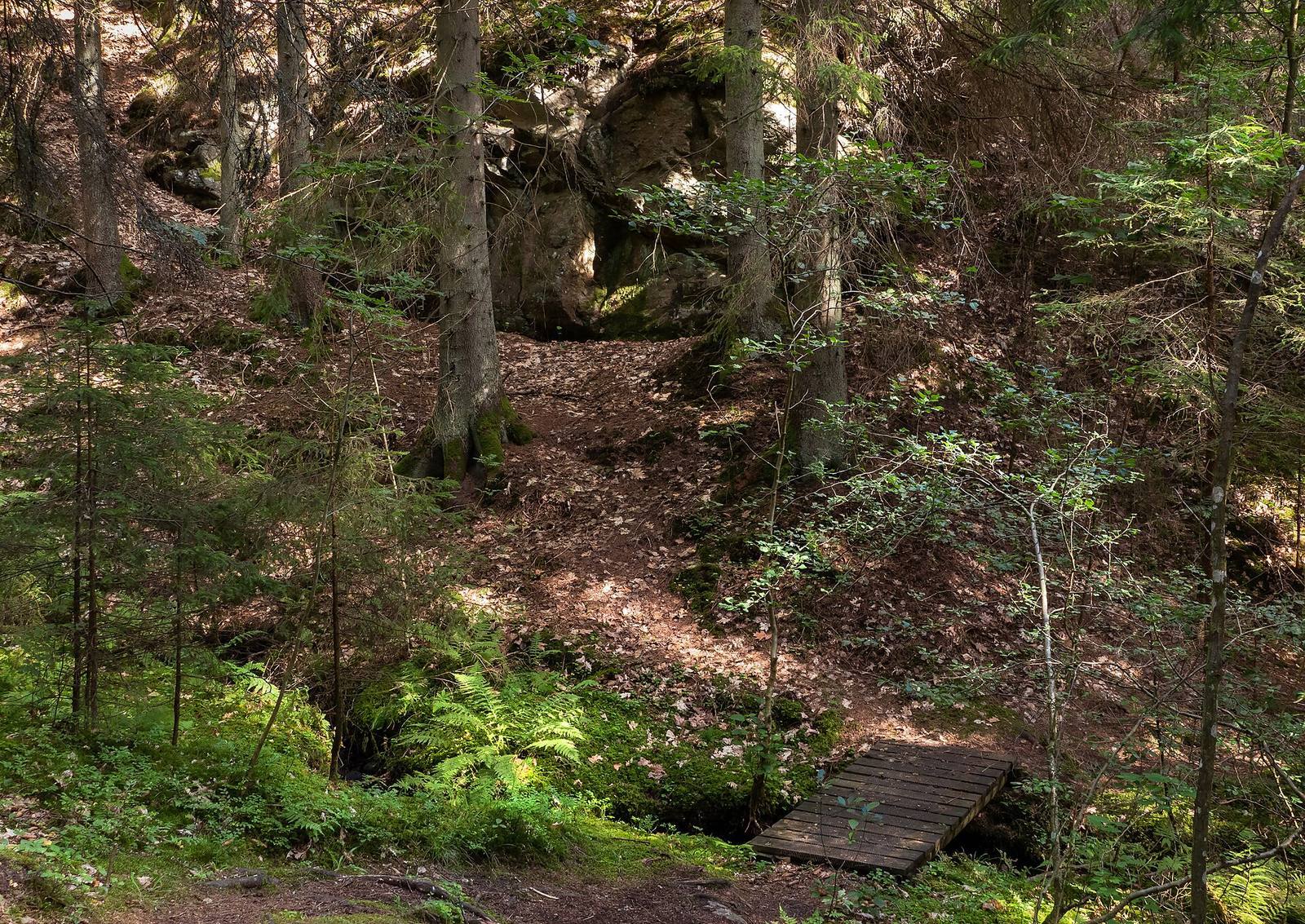 No sign, no arrow, and still you know exactly where to walk. Light pool, worn ground, a bridge as micro-landmark: three weak signals agreeing, which is worth more than any single strong one.
The signal hierarchy
In descending order of pull: light, colour contrast, motion, openings, landmarks. Eyes go to the brightest thing in view before any conscious thought happens.
- Light is the strongest magnet there is. A lit doorway in a dim room wins against every other exit, every time. This is not a preference; it's how the visual system is wired, and you can rely on it absolutely.
- Contrast & color: a warm accent in a cool scene, one saturated object among muted ones. "Follow the yellow paint" became a cliché because the perceptual mechanism underneath is reliable; the craft is dosing it subtly enough that players don't feel handled.
- Motion: a flapping flag, birds taking off, drifting smoke, falling dust. Peripheral vision is primarily a motion detector, so motion pulls the eye even when it's not being looked at directly.
- Openings: humans walk toward negative space, gaps, doorways, the bright horizon between two cliffs. A visible opening is an implicit invitation.
- Landmarks are the tower on the skyline that survives every camera angle and re-orients the lost from anywhere on the map.
None of these feel like instructions, which is the entire point. Players credit themselves for the navigation, and that feeling of competence is precisely what you're selling. The moment guidance feels like a rail, the magic dies, so the art is always the lightest touch that still works.
Compose the first frame of every space
Every entrance is a camera position. Stand in the doorway, screenshot what's in frame, and make sure the next objective (or a landmark pointing to it) is in that frame.
Leading lines do the pointing: road edges, fences, cables, a fallen log, the strata direction in your rock faces, the shoreline of a lake. The player's eye rides lines for free, so aim them. A practical greybox habit is to place the entrances first, screenshot each first frame, and fix those compositions before any dressing. Dressing can strengthen a working frame; it cannot repair a broken one, so composition is a blockout-phase job, not a polish-phase one.
The one-third rule from photography transfers directly: objectives placed on a third-line of the frame get found; objectives dead-center feel staged and theatrical; objectives at the frame edge get missed entirely. When you can't put the objective itself in frame, put a landmark associated with it in frame, and the eye will chase the landmark and find the objective on arrival.
Landmarks need a hierarchy
One primary landmark, visible from most of the map for global orientation, plus district-level secondaries, each unique in silhouette and colour, because similar landmarks actively mislead.
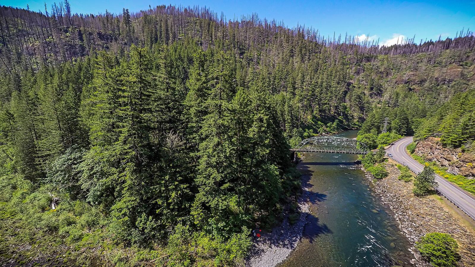 From above, the guidance layer is obvious: the river is a leading line, the bridge is a landmark and a goal, the road is a breadcrumb. On the ground the player reads the same structure without ever seeing the map.
The primary landmark answers "which way is north?" from anywhere; secondaries, such as a crane, a red roof, a broken bridge, anchor neighborhoods. Test them like an engineer: teleport a playtester to five random spots and ask them to point at three named places. Hesitation marks a landmark that isn't doing its job.
Two failure modes to hunt for. First, similar landmarks: two towers of the same silhouette and color will be confused, and the player will blame themselves for getting lost when the level actually lied to them. Make each landmark differ in shape and hue, not just in name. Second, landmarks that vanish: check every one against your weather and time-of-day range. A silhouette that disappears in fog or at dusk stops being a landmark exactly when players need it most, because orientation matters more in bad visibility, not less.
Breadcrumbs bridge the gaps
Between landmark views, small signals carry the line, such as lit windows in sequence, poles, tracks, glowing fungus, spaced so the next one is visible from the current one. One broken link stalls the whole chain.
Walk the route yourself and stop at every breadcrumb: can you see the next? The chain test is mechanical and catches what intuition misses, especially after a lighting change moves a shadow across a crucial marker. Pickups double as breadcrumbs and pay the player for following: an old trick that works because it compounds three things in one placement: guidance, reward, and pacing.
Spacing is a real number, not a feel: roughly every 15–30 m in open terrain, denser indoors where sightlines are short. Too far apart and the player stalls between crumbs; too close and the trail feels like a corridor of glowing dots, which breaks the "I found the way myself" illusion you're protecting.
Density steers too
Players avoid visual clutter and walk where movement looks easy, so dense vegetation off-path and sparse vegetation on-path shapes routes without a single fence.
This is the quietest tool in the box, and one of the strongest. A field of stacked crates, tight undergrowth or rubble reads "not the way" at a pure gut level; open walkable ground reads as invitation. You can shape a route through a forest without a single invisible wall by scattering vegetation dense off-path and sparse on-path. Because vegetation is usually placed with density masks anyway, the guidance layer costs nothing extra: it's the same mask, painted with intent. (Numivo's scatter drives density per species with painted masks and avoid/attract rules, which makes "sparse corridor through a dense forest" a thirty-second operation instead of an afternoon.)
The same principle governs readability during combat: firefight spaces need lower prop density than exploration spaces, or targets disappear into the clutter and players blame the game's readability rather than the level's dressing. Density handles guidance and readability at once; it tells players where to go and what to shoot.
Verify like a scientist
Use one fresh playtester, zero hints, and watch where they look and walk. Every hesitation marks a missing signal; every confident wrong turn marks a false one.
Confident wrong turns are the valuable ones: the player read a signal you didn't know you'd placed. Common culprits: an accidental light pool drawing the eye off-route, a composition line pointing at a wall, a landmark visible from a space it shouldn't organize. Fix the false signal, retest with a new player (the old one has learned the level and can no longer get lost the same way), and repeat. Guidance is invisible when it works, which is exactly why it can only be measured in someone else's hands. You are the worst possible tester of your own level, because you built the mental map.
Field numbers worth stealing
- Signals on the critical path: 3–4 weak ones, never one strong one
- Time a player gives a new space before frustration: about 2 seconds per glance, so your first frame must work at a glance, not at study
- Breadcrumb spacing: every 15–30 m in open terrain, denser indoors
- Landmark count that stays memorable: 1 primary + 3–5 secondaries per map
- Objective placement in the first frame: on a third-line, never dead-center
- Combat-space prop density: roughly half of exploration-space density
Mini-FAQ
Do these techniques work in open-world games? They work harder there. With no corridor to fall back on, light, landmarks and density are the only navigation layer you have. Open-world teams formalize it as "vista design": every major view is a composed frame with a clear read and a next destination.
What about accessibility? Never let color be the only signal. Pair hue with value contrast and shape, so a colorblind player reads the path through brightness and silhouette. Stacking multiple weak signals is itself an accessibility win: if one channel fails a player, another carries the load.
Can I skip guidance in a linear level? Linearity makes it cheaper, not optional. A player who feels lost in a corridor blames the game twice as fast, asking "how am I lost in a hallway?", so hesitation there means your signals are actively pointing backward. Even a rail needs its light pools in the right places.
How do I guide backtracking? This is the hardest case, because the composed first frames all faced forward. Solutions: two-sided landmarks that read from both directions, return routes that differ from the outbound path (so the player navigates rather than reverses), and light that marks the way back as deliberately as the way in.
Light pulls, lines point, landmarks anchor, density herds. Stack them gently, verify with fresh eyes, and players will praise your level for "flowing," without ever knowing why, which is exactly the outcome you want.