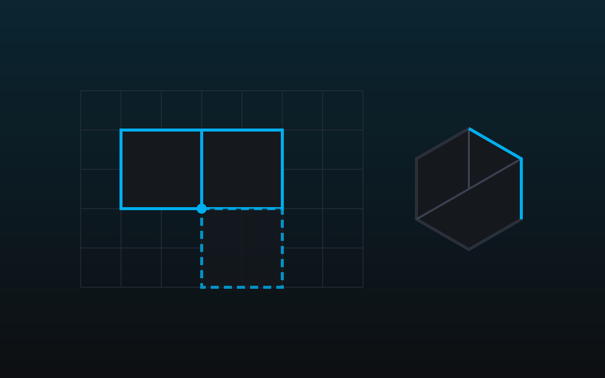
In short: A modular kit lives or dies on three decisions made before the first mesh exists: the grid size, the story height, and the pivot convention. Get those right and levels assemble like snapping bricks; get them wrong and every wall joint becomes manual labor forever.
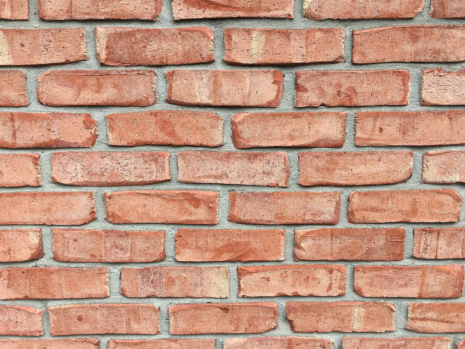 The oldest modular kit in the world. Nobody looks at a brick wall and sees repetition, because bond pattern, mortar and weathering break the rhythm at three different scales. Your kit needs the same three layers.
Pick a grid and make it law
Choose one base unit that divides cleanly, 1 m with 0.5/0.25 subdivisions, or a powers-of-two ladder, and require every kit piece to span whole units. Any two pieces snapped together must meet flush.
The grid is a contract between every artist who will ever touch the kit. Wall segments come in 1×, 2×, 4× the unit; the story height is fixed early (3 m and 4 m are common because they divide well and read spacious through a game camera). The acid test: assemble any two pieces on grid: no gaps, no z-fighting, no "nudge it half a unit." A piece that needs nudging is a broken piece, not a fussy level.
One subtlety that bites teams months in: choose the grid with your engine's snap settings in mind. If your kit is authored metric but the level artists snap in powers of two, the mismatch surfaces as thousands of 3-cm gaps that nobody can explain and everybody nudges shut by hand. Decide the snap value the same day you decide the grid, and write both on the kit contract.
Pivots decide between snapping and suffering
One convention, applied to every piece: bottom-back-left corner (or bottom-center), always ON the grid, never floating in the middle of the mesh. Rotation must happen in clean 90° steps around that point.
A wall whose pivot sits wherever the DCC export left it costs a few seconds of adjustment per placement. Multiply by thousands of placements across a project and pivot sloppiness becomes weeks of pure friction, the most avoidable time sink in environment art. The convention also encodes direction: with bottom-back-left, artists learn that walls "grow" rightward and upward, and muscle memory does the rest, so placement becomes automatic rather than considered.
Two companion rules that prevent the subtle failures: keep the mesh flush to its bounds (a stray 1-cm overhang breaks tiling in a way that's maddening to diagnose), and model watertight corner pieces: inner and outer corners as dedicated meshes, not mitred walls, because mitring in-editor never survives the second revision and produces seams under every light.
The starter kit is smaller than you think
About a dozen meshes covers a first interior kit. Ship it, build a real room, and let the room tell you what's missing.
- floor 1×1 and 2×2
- wall, wall-with-door, wall-with-window
- inner corner, outer corner
- doorway trim, one stair, one ceiling piece
- 2–3 "breakers": a pipe run, crates, a beam
Kits designed exhaustively up front always contain pieces nobody uses and lack the one piece everyone needs on day one. Growing the kit from real assembly pressure keeps it lean. It also keeps its texel density, material count and naming consistent, because each addition inherits its conventions from a working piece rather than from a spec document nobody re-reads. The first real room is the best kit designer you have; it complains precisely and for free.
Hiding the repetition
Repetition shows when the eye finds the rhythm, so break the rhythm at three scales: silhouette, material, and story (light and props).
- Silhouette breakers at intervals the eye can't count. Alternate at 5, 7, 11, prime gaps, never every 4th piece; a regular break is a rhythm, just a slower one the eye still finds.
- Trim and clutter across seams. A pipe crossing three wall pieces sews them into one surface; a decal over a joint erases it entirely. This is the highest return-per-minute technique in modular dressing.
- Two or three wear states of the same material, assigned irregularly: the brick-wall trick. Vertex paint or per-instance data is cheaper than extra textures and breaks the copy-paste read.
- Light does the differentiation. Identical corridors under different light temperatures read as different places; that's free variation that costs no geometry.
- Rotation and mirroring where the design allows: a floor tile used in four rotations quadruples its apparent variety at zero asset cost.
The brick wall is the perfect teacher here: every unit is identical, yet the bond pattern (silhouette), the mortar and weathering (material), and the way light rakes across it (story) combine so that no one ever perceives the repetition. Copy that stack.
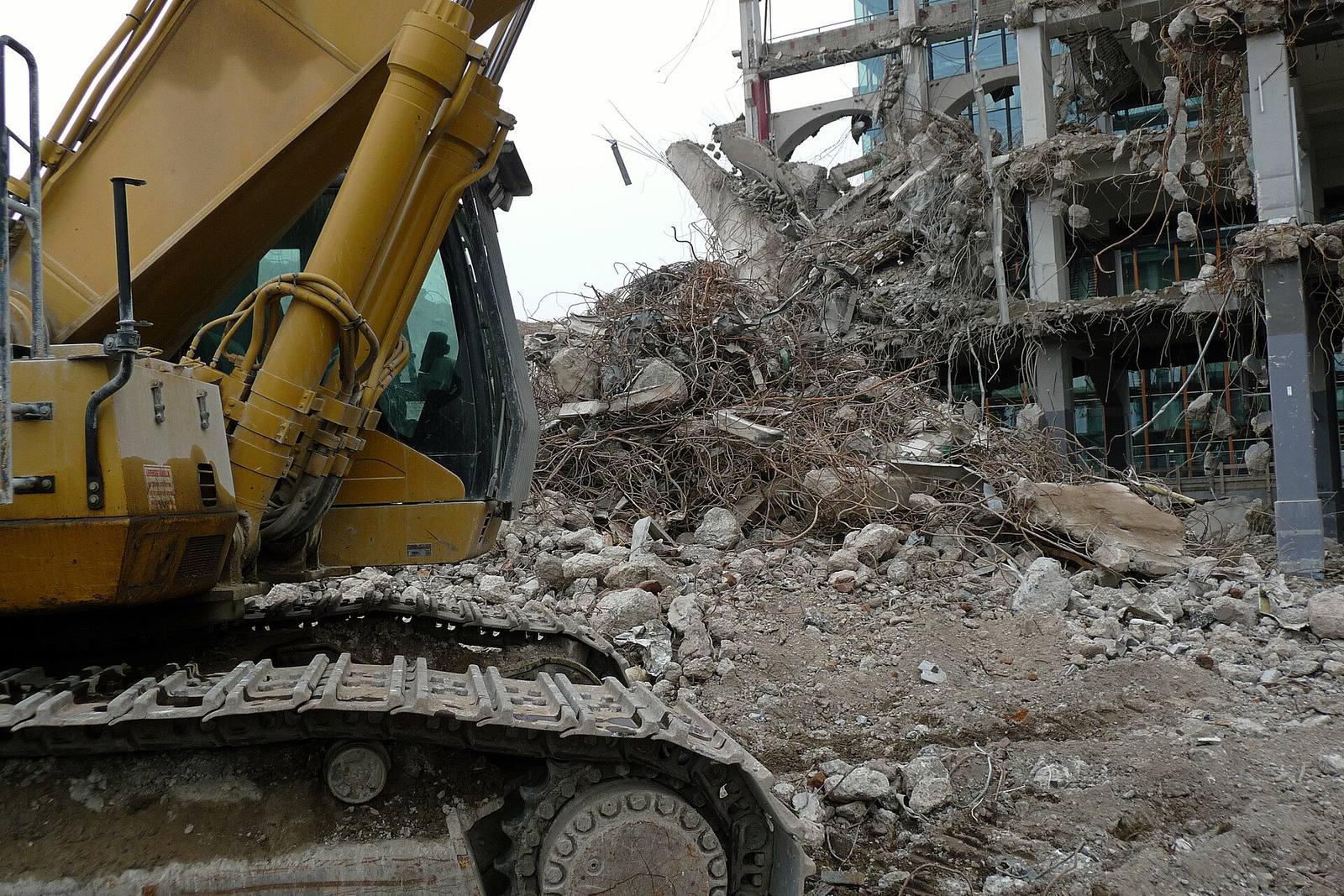 Real modular construction: identical structural units on a strict grid, assembled without gaps. Games rebuild this logic in miniature: the grid and the pivot are what make the pieces click.
Beyond the square grid
Rectangles are the easy case. Circular rooms, hex platforms and radial layouts fail by hand because manual rotation never closes the loop cleanly, so let tooling own the math.
Anyone who has hand-assembled a circular chamber knows the last segment never fits: accumulated floating-point rotation error leaves a sliver gap that gets "fixed" by eye, and then re-breaks the next time someone touches it. Grid tooling that lays out rectangular, circular, polygonal and hex arrangements with snapping and per-cell rotation directly on a surface, which is what Numivo's grids do, turns those layouts from special cases into one more brush, and closes the loop exactly, every time, with no accumulated error to nudge away.
Field numbers worth stealing
- Base units that survive production: 1 m (metric) or 0.25/0.5/1/2/4 m power ladders
- Story heights that read well in-game: 3 m interiors, 4 m industrial
- Starter kit size: ~12 meshes, grow from real assembly pressure
- Breaker spacing: prime intervals (5/7/11), never regular
- Texel density: pick one (e.g. 10.24 px/cm) and hold every piece to it: mixed density betrays modularity faster than geometry does
Mini-FAQ
Should the kit be one mesh per piece or trim-based? Both ship AAA games. Trim sheets win on texture memory and consistency; unique pieces win on sculpted detail. Most mature kits combine them: trim for the 80 % of connective surfaces, unique meshes for hero moments.
How do I retrofit a grid onto an existing messy kit? Don't rescale the levels. Rebuild the kit to the grid and re-assemble the key scenes from the new pieces. Painful once; the alternative is paying the per-placement nudge tax forever, which is far more expensive spread across a project.
When is modularity the wrong tool? Hero moments. The throne room, the crash site, the finale vista deserve bespoke geometry: modularity buys speed for the connective tissue precisely so you can afford handcraft where it counts. A game that's modular everywhere reads as modular everywhere.
How many wear states do I actually need? Two or three. One is the copy-paste tell; four or more is diminishing returns and texture-memory cost. Two states assigned to prime-interval positions already breaks the rhythm for the human eye.
Write the one-page kit contract: grid unit, snap value, story height, pivot rule, naming scheme, piece list, before the first mesh. The page costs an hour. Not having it costs every hour after.