In short: A small level can feel vast through perception rather than square kilometres. Use unreachable landmarks, atmospheric depth, vertical layers, forced perspective, human-scale anchors, and carefully framed reveals to imply space beyond the playable boundary. Combining several subtle cues creates scale without the production, streaming, and performance cost of a genuinely enormous map.
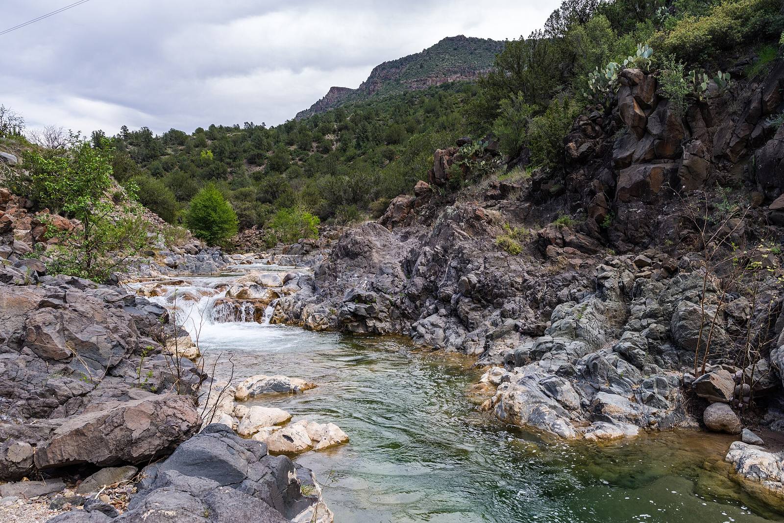 Almost none of this is walkable, and that's the point. The unreachable mountains and the receding valley do the work of scale: the playable path is a thin ribbon through a world that only needs to be seen, not built.
Scale is felt, not measured
Players never pace out your map. They judge size by cues: distant landmarks, how small a human looks against the surroundings, how far the eye travels before things fade. Nail the cues and a small space feels vast.
The brain estimates size from relationships, not rulers. A room feels big because the door is small next to it; a valley feels vast because a tree on the far ridge is a speck. This is liberating for a level designer, because it means you don't have to build huge to feel huge: you have to arrange the right cues. The most expensive way to make a level feel big is to actually make it big; almost every other method on this list is cheaper and, done well, more effective, because a genuinely huge empty map often just feels empty.
Distant unreachable landmarks
Put a dramatic landmark far outside the playable space, a mountain, a tower, a ruined megastructure, that the player can see but never reach. It implies a world extending far past the level's actual walls.
The single most powerful vastness tool is the thing you can see but not touch. A towering spire on the horizon tells the player the world is enormous, even if the walkable area is a small bowl in front of it. It costs almost nothing: a low-detail model far away, often little more than a silhouette, yet it defines the entire perceived scale of the space. It also does double duty as a navigation beacon and a composition anchor. Every big-feeling open level leans on this: the mountain you're always walking toward, the city you can see but only enter in chapter nine.
Forced perspective and false distance
Making distant elements progressively smaller and lower-detail than true scale would demand tricks the eye into reading extra distance. A "mountain range" can be a few hundred metres of shrinking, fading geometry.
The film trick works in games: by compressing what would be kilometres of terrain into a shrinking, hazing sequence of ridges, you convince the eye it's looking much farther than it is. Each successive layer is smaller, paler and less detailed, and the brain fills in "that's far away, therefore the world is big." This is how a skybox or a background diorama sells a continent's worth of distance from a shell that's meters deep. Combine it with the unreachable landmark and the playable area can be tiny while the perceived world is boundless.
Human-scale anchors
Place objects of known size, doorways, vehicles, stairs, a figure, so the eye has a ruler. A structure reads as gigantic only when there's a human-sized thing next to it for comparison.
Scale is meaningless without a reference. A giant wall is just a wall until you put a normal door in it, and suddenly the wall is monumental. Cathedrals, canyons and megastructures all rely on this: the tiny familiar element that makes the huge element legible as huge. So when you want something to feel enormous, give the eye a human-sized anchor beside it: a railing, a crate, a distant figure on the path. Without the anchor, "big" doesn't register; with it, the same geometry feels overwhelming.
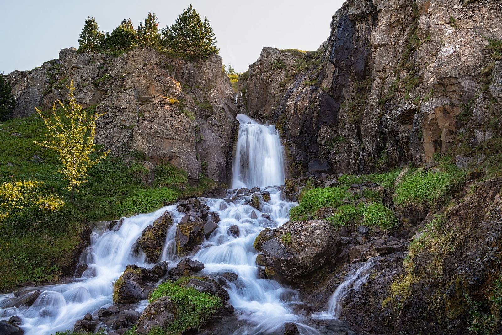 Verticality reads as scale instantly: the eye has to travel up and down to take it in, and that travel is the feeling of size. A tall thing feels bigger than a wide thing of equal volume.
Verticality
Height reads as scale more strongly than width. A tall space forces the eye to travel up and down, and that journey registers as bigness, so build up, not just out, to feel large cheaply.
Given equal floor area, a space that goes up feels far larger than one that only spreads out. Towering interiors, deep chasms, and structures that disappear overhead all exploit the fact that vertical distance is more dramatic to the eye than horizontal. Verticality also multiplies your other tricks: it gives you high vantage points from which to reveal the distant landmark, and low points that make the surroundings loom. Reaching for height is often the cheapest way to trade a modest footprint for an epic feeling.
Atmosphere and the fade
Fog, haze and atmospheric falloff make distance visible. When far things get paler and softer, the eye reads real depth. A clear-to-the-horizon scene can paradoxically feel flat and small.
Air has colour, and reproducing that is one of the strongest depth cues you have. When distant geometry fades toward the sky colour and loses contrast, the brain reads genuine distance and the space swells. A scene with perfect clarity to the horizon can feel oddly small and flat, like a painted backdrop, because the depth cue is missing. A touch of atmospheric perspective, even subtle, separates your distance layers and makes the world feel like it has real air and real depth in it. Measuring your key sightlines helps here: knowing exactly how far the eye travels lets you tune the fade so the landmark reads as far rather than merely small, and a measuring tool in the editor (one lives in the free tier of Numivo) turns that from guesswork into a set distance you can dial.
Field numbers worth stealing
- The cheapest vastness tool: a distant unreachable landmark (a silhouette)
- Scale is relative: always give the eye a human-sized anchor for comparison
- Height > width for perceived size at equal volume
- Atmospheric fade sells distance; perfect clarity reads flat
- Don't build big to feel big: arrange the cues; a huge empty map just feels empty
Mini-FAQ
Won't players feel cheated when they can't reach the landmark? No, players intuitively accept that not everything is walkable, the way they accept a skybox. What breaks immersion is an obviously fake or low-effort distant element, not an unreachable one. Make it convincing, not reachable.
How do I stop a big-feeling level from also feeling empty? Density where the player is, vastness where they aren't. The playable ribbon should be rich and detailed up close; the sense of scale comes from the unreachable surroundings. Empty comes from thin dressing on the path, not from a big backdrop.
Does this work in first person and third person? Yes, though third person reads verticality and scale even more strongly because the character in frame is a constant human anchor. First person leans harder on doorways, vehicles and distant figures for the same reference.
What's the most common scale mistake? Building the whole world to true size, which is expensive and often less impressive than a compact space with strong cues, and getting the anchor scale wrong, so nothing reads as big because there's no correctly-sized reference to measure against.
Vastness is a magic trick, and the audience wants to be fooled. Give them a landmark they can't reach, an anchor to measure by, height to climb and air to see through, and they'll remember your compact, affordable level as one of the biggest places they've been.