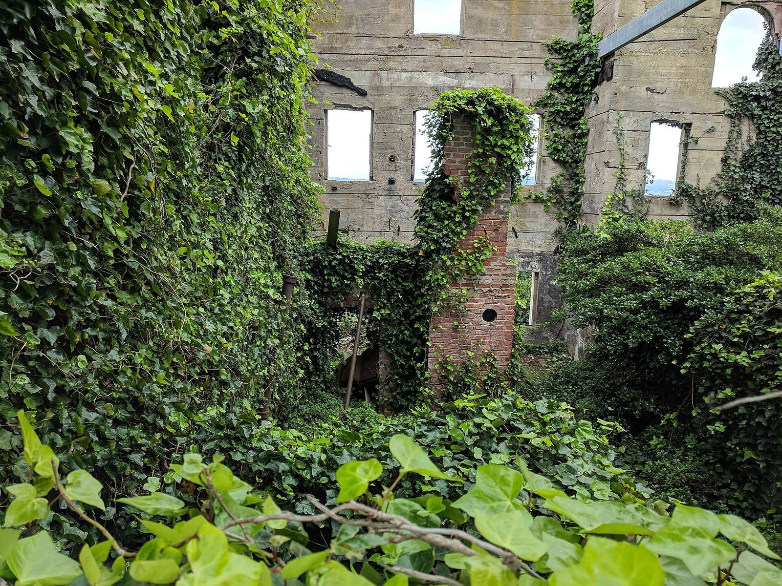
In short: Lighting is the fastest way to make a game environment feel like something: safe or threatening, warm or clinical, alive or abandoned. It works largely below the player's awareness. The levers are few: contrast, colour temperature, direction, and motivation (a believable source).
 One shaft of light in a dark space does more emotional work than a hundred evenly-lit props. Contrast is mood: the darkness makes the light mean something.
Light is emotion before it is illumination
Players read a lit space emotionally in the first second, long before they parse what's in it. Bright and warm reads safe; dim and cold reads threat; high contrast reads drama; flat even light reads neutral or dead.
Before a player notices a single asset, the lighting has already told them how to feel. This is why lighting is the highest-leverage pass for atmosphere and why a beautiful set of models can still feel lifeless if it's lit like an office. The job of environment lighting is only half "can the player see"; the other half is "what does this place make them feel," and that half is decided by contrast, colour and direction more than by brightness. Treat every light as an emotional choice as well as a visibility fix.
Contrast is the mood dial
The ratio between your brightest and darkest areas sets the drama. High contrast (deep shadows, sharp pools of light) feels tense and cinematic; low contrast (soft, even) feels calm, mundane or safe. Choose it on purpose per space.
The single most expressive control you have is how far apart your lights and darks sit. A space with deep shadows and a few bright pools feels charged: noir, horror, tension. The same space flooded with even light feels ordinary, even boring. Neither is wrong; they're tools. A safe hub wants low contrast and warmth; the corridor before a boss wants deep shadow and one hard light. The classic beginner mistake is being afraid of darkness: lighting everything "so the player can see," which flattens every space into the same neutral mood. Embrace shadow; it's half of your composition.
Colour temperature carries feeling
Warm light (oranges, yellows) reads as safe, human, alive, inviting; cool light (blues, cyans) reads as cold, sterile, eerie, distant. Playing warm against cool in the same frame creates depth and tension at once.
Colour temperature is emotional shorthand every human already understands from firelight and moonlight. Warm pools say "people, safety, home"; cool washes say "night, machine, unease." The most reliable atmospheric trick is contrast of temperature: a warm interior seen through a cool doorway, a warm campfire in a cold blue night. That warm/cool split reads as depth, draws the eye to the warm (which feels like the goal), and gives the frame emotional tension for free. Pick a temperature story for each space and let a complementary accent fight it just enough to keep the eye moving.
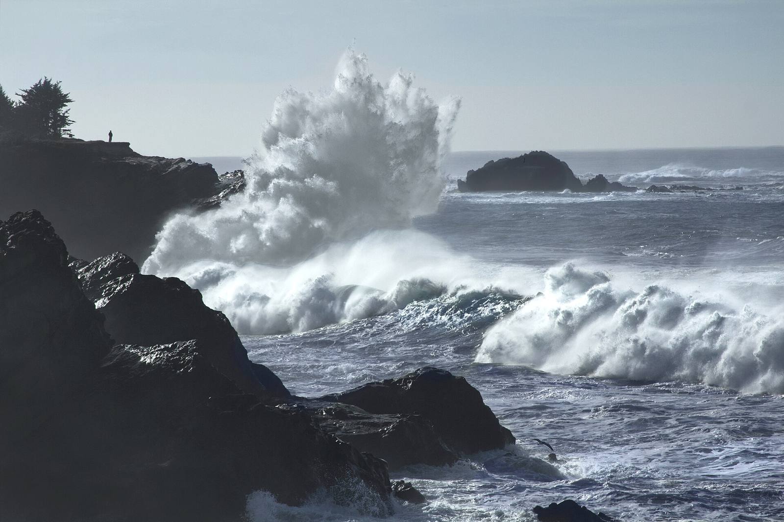 Mood without a single prop: desaturated colour, low key, cold temperature and a heavy sky. The environment is doing the emotional work that dialogue or music would otherwise have to carry.
Motivated light feels real
Every light should have a believable source in the world: a window, a lamp, a fire, the sky. Unmotivated light (a glow from nowhere) reads as fake even when players can't articulate why.
Believability comes from motivation: the eye accepts light that has a visible cause and quietly rejects light that doesn't. A warm glow with no lamp, a bright room with no window: these register as wrong on a subconscious level. So place the source, or imply it: a shaft implies a gap above, a flicker implies fire, a cool ambient implies sky. This also gives you an art-direction gift: the sources become focal points and storytelling props. A single practical light, whether a lantern, a monitor, or a crack of daylight, often does more for a scene than a rig of invisible fill lights.
Use light to guide, not just to dress
Players walk toward light. Brighten the path and the objective, let dead ends fall into shadow, and you get navigation for free: mood and guidance from the same lights.
Light is one of the strongest wayfinding tools there is, because "move toward the bright, safe-looking area" is a deep human instinct. Lean on it: the route forward is brighter, the important door catches a pool of light, the dead end stays dim. Now your lighting is pulling double duty, setting mood and steering the player, and the two reinforce each other, because the place you want them to go is also the place that looks inviting. When mood-lighting and guidance-lighting fight (the scary dark corridor is also the only way forward), resolve it with a single motivated light at the far end: a reason to walk into the dark.
Field numbers worth stealing
- The mood dial: contrast ratio, high for drama/tension, low for calm/safe
- Temperature story: warm = safe/alive, cool = cold/eerie; contrast them for depth
- Every light needs a motivated source, real or implied
- Players move toward light: brighten the route, shadow the dead ends
- The fear to unlearn: darkness is a tool, not a failure to light
Mini-FAQ
Baked or dynamic lighting for mood? Either delivers mood: the choice is a performance and workflow decision, not an aesthetic one. Baked lighting can be gorgeous and cheap; dynamic reacts to time and events. Pick for your budget and gameplay, then apply the same contrast/temperature/motivation thinking regardless.
How do I keep a dark, moody scene readable? Keep the gameplay-critical elements, the path, interactables, threats, lit with motivated pools, and let everything else fall into shadow. Readability lives in contrast, not brightness: a dark scene with a few clear bright anchors reads better than a uniformly dim one.
Why does my scene look flat despite lots of lights? Usually too many fill lights washing out the shadows, or a single flat colour temperature everywhere. Cut fill until shadows return, and introduce a warm/cool contrast. Flatness is almost always missing contrast, of value or of temperature.
Does colour grading replace good lighting? No: grading is the final polish on top, not a substitute. It can push an already-good lighting scene further, but it can't manufacture contrast, direction or motivation that isn't there. Light first, grade last.
Lighting is where a level stops being a set of rooms and becomes a place with a feeling. Decide the emotion, set your contrast and temperature to serve it, motivate every source, and let the bright spots pull the player forward, and a grey blockout turns into somewhere players remember how it felt to stand.