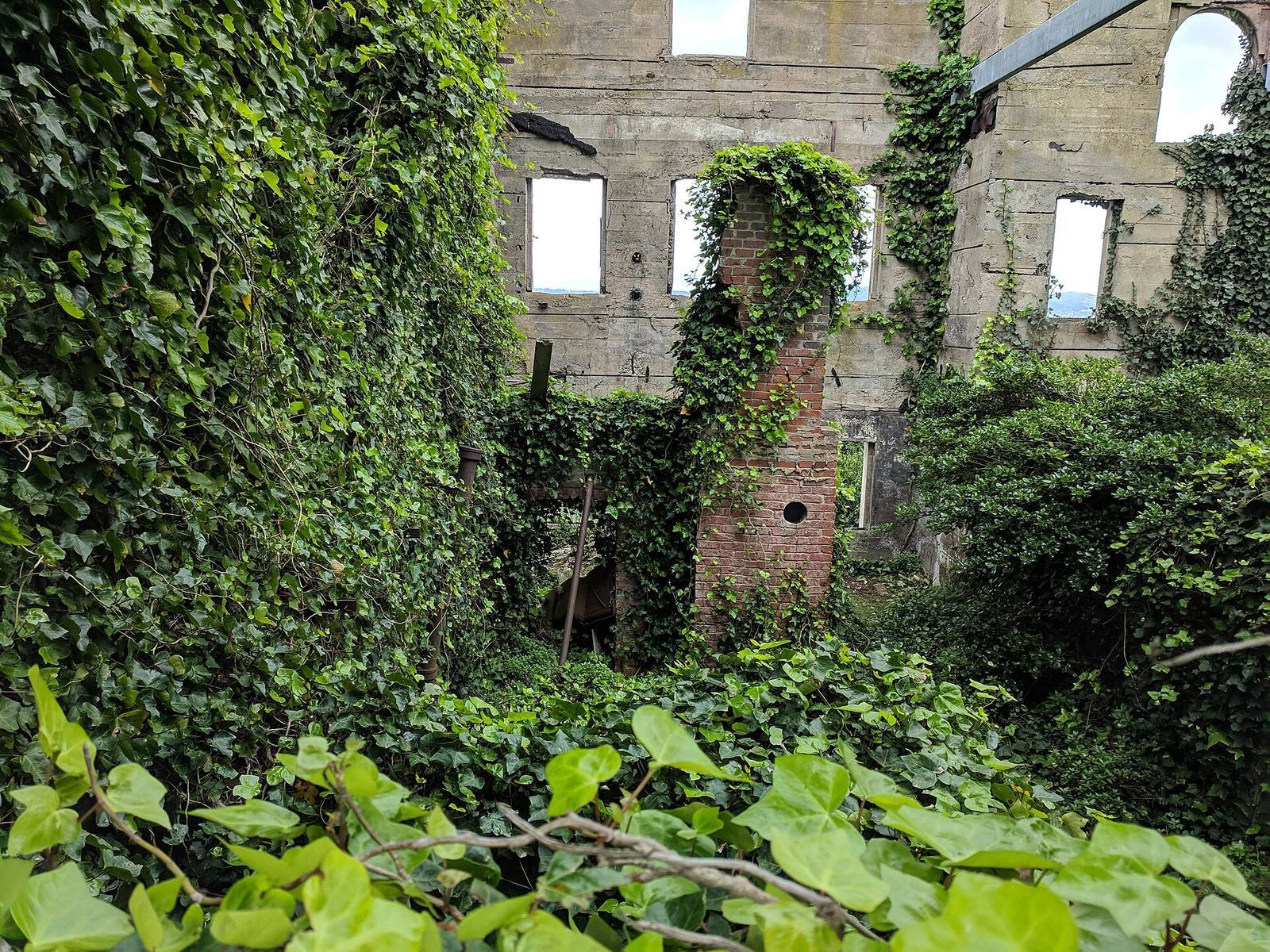
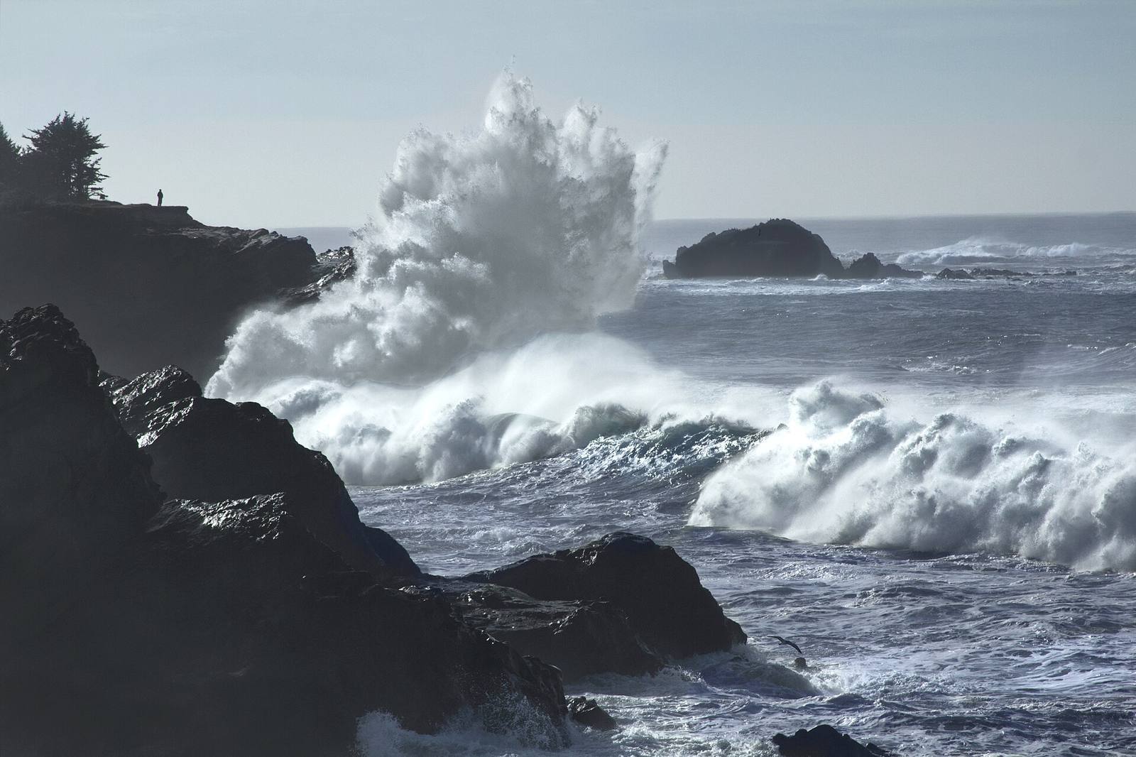
In short: Composition in a game environment is harder than in a photograph because the camera moves and you don't own it, yet the same tools apply. Leading lines, framing, a clear focal point, foreground-midground-background depth, and value contrast all steer the player's eye.
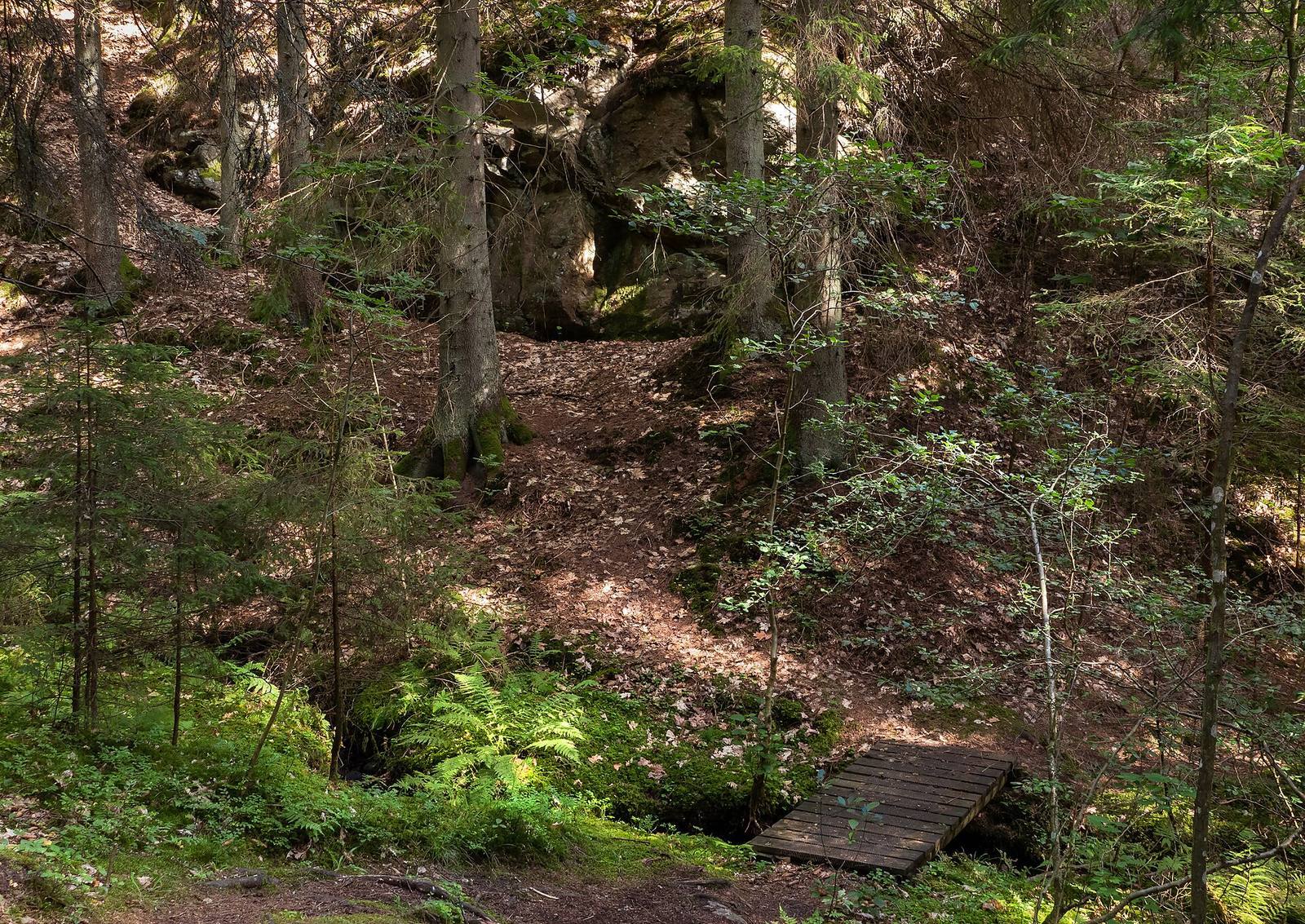 A path is the most honest composition tool there is: it physically tells the eye, and the player, where to go. Every strong environment shot has an invisible version of this line running through it.
Why composition is different in games
A photographer picks one frame; you compose a space the player will see from hundreds of angles while moving. So you compose the PATH, the sequence of views a player actually gets, not a single hero shot.
This is the mental shift that separates environment composition from concept art. A concept artist controls one camera; you control none directly. What you can control is where the player walks, where they can and can't see, and what's framed when they arrive at each point. So you stop thinking "what's the best screenshot here" and start thinking "what does the player see at the doorway, at the turn, at the top of the stairs." Compose those handful of inevitable views deliberately, and the space feels art-directed even though the player is driving.
Leading lines
Roads, rivers, fences, walls, light shafts and rows of objects are arrows. Point them at what matters, the objective, the vista, the next door, and the eye follows without the player noticing.
Leading lines are the strongest and cheapest guidance tool in 3D. A path, a run of pipes, a fallen log, a beam of light: anything linear reads as a direction. Aim them and you get free wayfinding and free composition at once. The failure mode is accidental leading lines that point at nothing, or worse, point away from where the player should go; a corridor whose strongest line drags the eye into a dead corner will have players missing the actual route. Audit your strong lines and make sure they converge on something worth arriving at.
Framing
Surround a focal point with darker or nearer elements, a doorway, an arch, overhanging branches, a gap between rocks, so the composition has a natural window. Frames create focus and depth in one move.
A framed view reads as intentional and draws the eye through the frame to the subject. Doorways and arches are the obvious architectural frames; in nature, overhanging foliage, rock formations and tree trunks do the same job. Framing also manufactures depth for free, because the frame sits nearer the camera than the subject, establishing a foreground layer. Reveal your best vistas through a frame: a landmark glimpsed through a ruined archway lands harder than the same landmark on open ground.
A clear focal point
Each key view should have ONE thing the eye lands on first: the brightest area, the highest contrast, the point where lines converge. If everything competes, nothing wins and the shot reads as noise.
Ask of every important view: what does the eye hit first? If you can't answer instantly, neither can the player, and the composition is mush. Create the focal point with contrast (a bright shape against dark, or vice versa), with convergence (leading lines meeting there), or with isolation (one detailed object in a calm field). The most common environment-art mistake is uniform interest, every surface equally detailed, equally lit, which paradoxically makes the scene less readable, because the eye has nowhere to rest and nowhere to go.
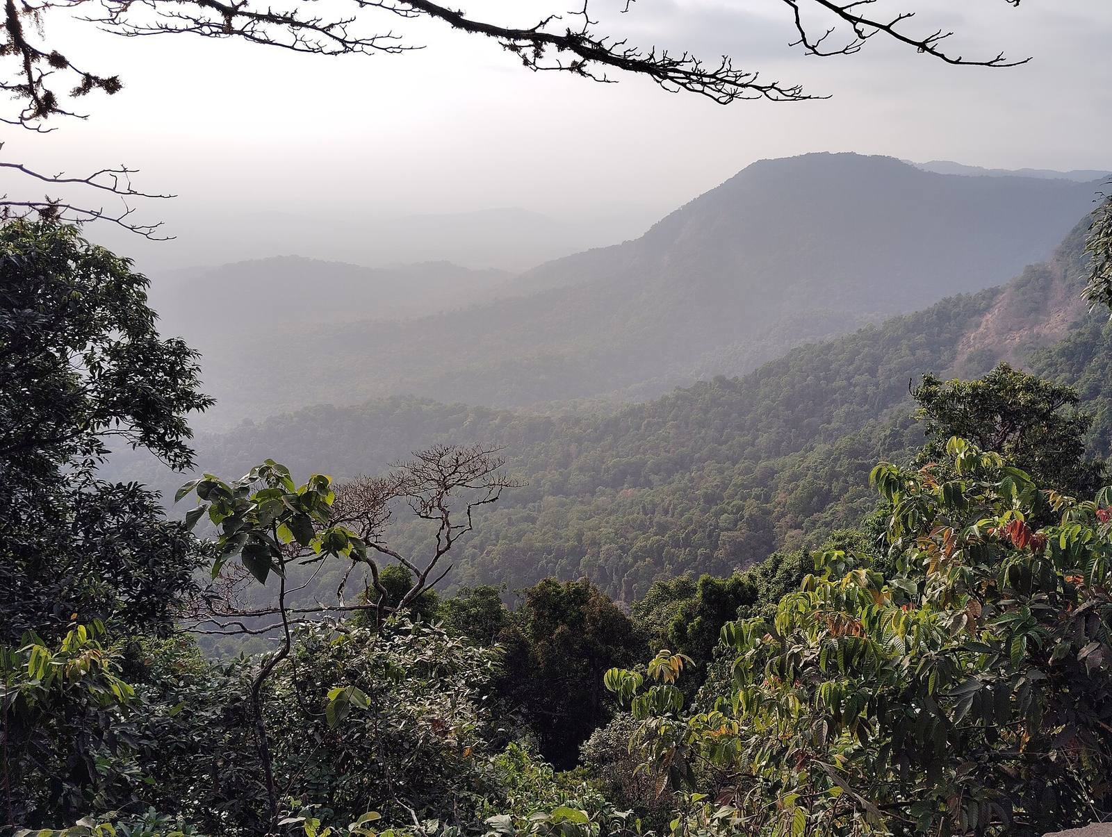 Atmospheric perspective doing the work: each ridge is lighter and lower-contrast than the one in front. That value separation is what turns a flat backdrop into a space with real depth.
Depth: foreground, midground, background
Build every important view in three distance layers, each visually distinct. Atmospheric perspective, distant things lighter, hazier, lower contrast, sells depth more than any polygon count.
A scene without layered depth looks like a flat backdrop no matter how detailed. Deliberately place a foreground element (a rock, a branch, a bit of ruin), a midground where the action is, and a background that recedes. Then lean on atmospheric perspective: real air makes distant objects paler, bluer and lower in contrast, and reproducing that, with fog, a subtle desaturation, or lighting falloff, reads as distance instantly. This is why a foggy valley feels deep and a clear one can feel like a painted wall: the fog is doing your depth cues for you.
The squint test
Squint at your scene until detail blurs. The big shapes and value masses should still read: you should still know where to look. If it turns to grey mush, the composition is broken no matter how nice the textures are.
This one check catches more composition problems than any tutorial. Squinting removes texture and colour and leaves you with the value structure, the pattern of light and dark masses, which is what the eye actually navigates by. If the focal point still pops and the layout still reads when squinted, your composition is sound. If it dissolves into an even field, you have a value problem that no amount of detail will fix; you need bigger contrast between your masses. Do this test constantly, at every pass.
A method you can repeat
- Mark the inevitable views. Walk the player path and note every spot where they'll naturally look: doorways, turns, arrivals, vistas.
- Give each one a focal point. Decide the single thing the eye should hit, and make it win on contrast or convergence.
- Run lines to it. Arrange architecture, light and props so the strong lines point at that focal point.
- Layer the depth. Add a foreground element and push the background back with atmosphere.
- Squint-check every view. If the structure survives the squint, move on.
Measuring where the player actually stands and looks turns this from guesswork into placement you can verify: clicking two points to check a sightline or a framing distance beats eyeballing it, which is one reason a measuring tool lives in the free tier of Numivo: deliberate composition starts with knowing exactly what the camera will frame.
Field numbers worth stealing
- Depth layers per important view: 3 (foreground / midground / background)
- Focal points per view: 1 (more than one and the eye has no anchor)
- The check that catches most problems: the squint test for value structure
- Atmospheric perspective: distant elements lighter + lower contrast, always
- Compose for the path, not the postcard: the player never stops where you'd take the screenshot
Mini-FAQ
Does the rule of thirds apply when the player controls the camera? As a habit of placement, yes: put focal points and horizons off-centre when you frame views (cutscenes, fixed cameras, arrival moments). For free-roam, it matters less than leading lines and value contrast, which work from any angle.
How do I compose when the player can look anywhere? You can't control every frame, so control the space: block sightlines with geometry, open them deliberately toward what matters, and light the important things brighter. You're composing the set, not the shot.
Isn't this just concept-art advice? The principles are shared, but the application inverts: concept art composes one fixed frame, environment art composes a navigable space that yields many frames. The skill is making the space compose itself well from the angles players will actually use.
My scene has great assets but looks flat. Why? Almost always missing depth layers and value contrast. Add a foreground element, push the background back with atmosphere, and increase the contrast between your big masses. Detail doesn't create depth; layering and value do.
Composition is the difference between a warehouse of nice assets and a place that guides, breathes and holds the eye. Compose the path, give each view a focal point, run your lines to it, and squint, and the player will look exactly where you meant them to, without ever knowing you decided it for them.