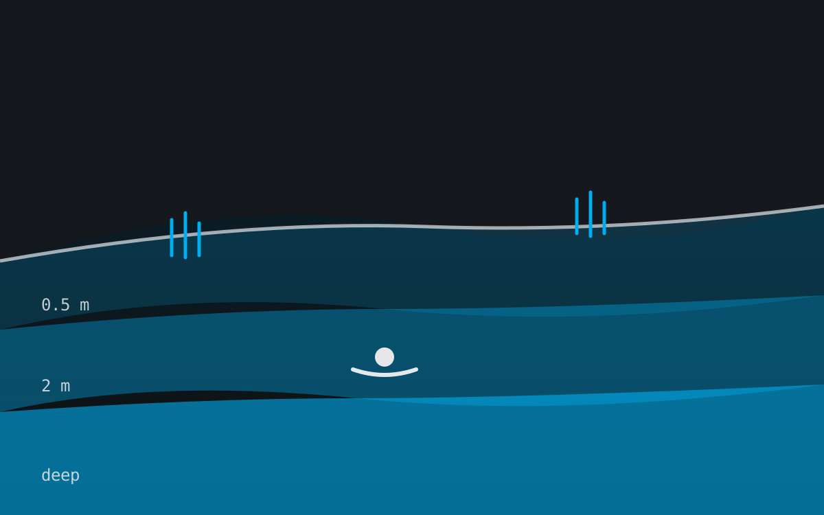
In short: Good playable water answers three questions before the player enters it: can I go in, how deep is it, and is it dangerous? Color, motion, shoreline shape, and consistent interaction rules communicate those answers. Depth then becomes a useful tool for pacing, navigation, risk, and atmosphere.
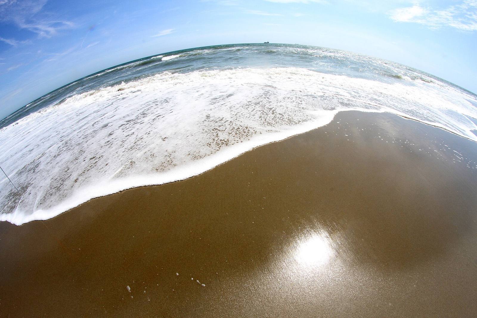 Everything legible about water is visible in one strip of beach: the foam line marking the active edge, the wet darkening above it, the safe gradient into the shallows. Players read all of it in a glance, because they've stood here in real life.
The three questions
Whatever your game's water rules are, the craft is making them legible BEFORE the player commits: color and clarity encode depth, motion encodes force, edges encode entry.
- Color and clarity encode depth. Bright, clear, visible bottom = safe and shallow. A darkening gradient toward the middle = it gets deep. Opaque murk = warning, possibly hostile. This grammar is nearly universal across games because it mirrors physical reality (light attenuates with depth), so use it rather than fighting it.
- Motion encodes danger. A still surface reads calm; ripples, foam lines and current streaks read force. A river that will sweep the player away should look like it would: fast surface texture, standing waves behind rocks, debris moving with the current.
- Edges encode entry. A gentle sand or gravel slope invites; reeds and a wet band say "wadeable"; a vertical rock face says "this is a wall that happens to be wet." Players judge enterability from the bank's silhouette alone, before they're close enough to test it.
Why these three and not more? Because a player moving at speed samples a body of water in roughly a second and files it under one of a handful of mental categories. Give them a fourth or fifth signal and you're adding noise, not clarity. The masters of water design are ruthless about saying exactly three things, loudly.
Consistency is a contract
Write your water rules down like jump heights: at which depth wading becomes swimming, what current speed is lethal, what harmful water looks like, and never violate the sheet. One exception costs every previously earned instinct.
If dark water was bottomless in chapter one, a dark knee-deep puddle in chapter four makes players distrust every pool afterward. Water hesitancy is expensive, because players who don't trust water simply route around entire sections of your level, skipping the content you built there. The sheet is short: three or four depth thresholds, one danger color, one safe color, and your entry-edge grammar. The discipline is applying it in every biome, including the atmospheric swamp where murk is "just the mood." Atmosphere is precisely where the contract gets broken, because it feels like an art choice rather than a rules choice. It is a rules choice.
There's a subtle corollary: the contract must hold across your lighting conditions too. Water that reads shallow-and-safe at noon can read deep-and-hostile at dusk if you let color do all the work and lighting shifts the hue. Anchor depth cues in value (brightness) contrast, which survives time-of-day, and let color be the confirming second signal.
Shorelines are composition lines
A shoreline is the strongest leading line terrain can give you. Curve it so it points somewhere: around the bend, toward the landmark, into the cove where the reward sits. Straight shorelines waste free guidance.
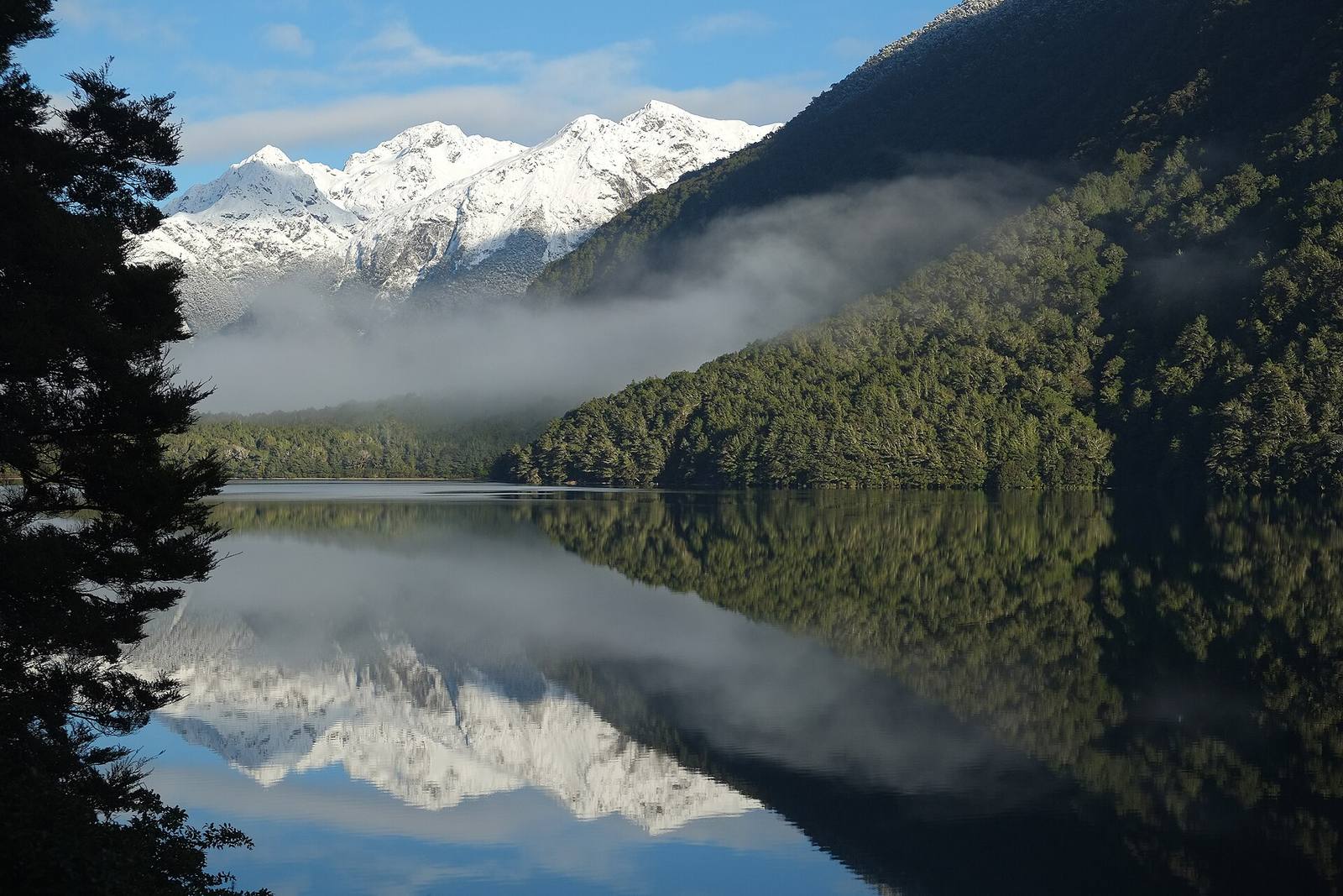 Still water is a mirror and a leading line at once. The eye rides the shore into the distance for free, and the perfect reflection doubles every landmark you place on the far bank.
Real banks alternate promontories and bays, and each bay is a natural stage: a camp, a wreck, a dock, an ambush. The eye rides the water's edge without being told to, which makes the shoreline your cheapest breadcrumb chain. Selling the edge up close is detail work with outsized return:
- a wet darkening band above the waterline (20–40 % value drop, a third of a meter to a meter tall) that tells players where the water has recently been;
- driftwood, reeds and debris in the splash zone, scattered rather than placed in a line;
- foam collecting where waves actually break, and in the corners of bays where circulation traps it;
- reflections: still water doubles every landmark on the far bank, which is a gift for orientation and a trap if the far bank is a mess.
That strip is the difference between "terrain touching a water plane" and "a place," and it's exactly the part players inspect from arm's length while walking the shore.
Depth as a level-design tool
Shallow water is a pacing brush (slows movement, builds tension), swimming is an escape valve and a vulnerability at once, and underwater adds a soft timer, all without new mechanics, purely through placement of depth.
- A knee-deep crossing before a combat arena is a breath: the slowdown telegraphs "something is about to happen" better than any music sting.
- Forced wading under fire is tension: a movement penalty as difficulty, visible and fair, because the player can see exactly why they're slow.
- Swimming strips most players' offense, an escape valve for the overwhelmed and a vulnerability the level can exploit knowingly (an ambush that starts the moment you're mid-channel).
- Underwater passages put a gentle timer on exploration and turn air pockets into memorable micro-goals.
Depth layout is gameplay scripting by other means. The level "knows" where players slow down, where they lose their weapons, where they surface gasping, and you can stage encounters against that knowledge. A designer who thinks of water depth as a difficulty and pacing curve, rather than as scenery, gets free encounter design out of terrain they were building anyway.
The special cases: caves, underwater, hostile water
Enclosed and dangerous water break the open-water grammar. A cave pool has no sky to reflect, underwater removes the surface cues entirely, and hostile water must telegraph harm through three channels at once.
 A cave pool has no sky to borrow color from and almost no motion. Its entire read comes from reflection of the cave itself and the faint disturbance of drips, get those wrong and it looks like black glass, not water.
Cave and underground water is the hardest to sell precisely because it removes your two strongest tools: there is no sky to reflect and often no wind to move the surface. What's left is reflection of the cave interior, the ripple from a drip, and the way light from a distant opening scatters through it. Lean on those hard; a still cave pool that reflects nothing reads as a hole, not water.
Underwater, the surface cues vanish: you can no longer judge depth from above. Now color absorption does the storytelling: warm colors drop out first, so "how blue and how dark" tells the player how deep they've gone. Add a soft directional light from the surface and particulate in the water, and you get the dive-footage feel that players read instantly.
Hostile water needs the most discipline. One channel is a guess; stack three and it's a promise: a color break (the one hue you reserve for harm), a motion anomaly (bubbling, unnatural stillness, a sheen), and shoreline evidence (bones, dead vegetation, rusted metal). Players who get hurt by water that looked safe will never trust your water again, so over-telegraph harm rather than under-telegraph it.
Dressing the banks
Water edges concentrate life and scrutiny: reeds attracted to the waterline, moss on the splash rocks, ground flowers keeping their distance. Careless placement shows here first: grass growing out of the lake is the aquarium-decoration tell.
Species relationships do the heavy lifting: reeds and cattails attract to the water edge within a couple of meters; meadow species avoid it; trees lean subtly toward the open-water light. That's a handful of rules, not hand-placement. Numivo's scatter expresses them directly as per-species attract/avoid relations with distance bands, which makes a convincing shoreline a settings change rather than an afternoon of manual work. Whatever tool you use, audit the waterline after every terrain edit, because it's where floating and clipping artifacts migrate: raise the terrain a meter and yesterday's tidy reeds are suddenly hovering.
The squint test, water edition
Screenshot the scene, squint: the water should still read enterable-or-not, deep-or-shallow, calm-or-dangerous. If the answers blur, fix value contrast and edge shapes before touching materials.
Players decide from ten meters away, and so should your review. A second check is the grayscale pass: depth gradients that survive desaturation will read for colorblind players and in every lighting condition; gradients that live purely in hue will not. If your beautiful teal-to-navy depth gradient becomes a flat gray smear in black and white, it's carrying no information for a meaningful slice of your players.
Field numbers worth stealing
- Decision distance: players judge water from ~10 m, review at that range
- Wading-to-swimming threshold most games settle on: ~1.2–1.4 m
- Wet darkening band above the waterline: 20–40 % value drop, 0.3–1 m tall
- Reed attraction band: within ~2 m of the edge; meadow avoidance beyond
- Depth cue priority: value gradient first, hue second, since it must survive grayscale
- Signals for hostile water: 3 channels (color, motion, shoreline evidence), never one
Mini-FAQ
Should water ever be purely decorative? Yes, but then make it visibly unreachable (far below a rail, beyond a cliff). Ambiguously reachable decorative water generates more frustrated minutes per player than any other prop category, because players keep testing whether they can get in.
How do I handle rivers with current? Current is motion made directional. Show it (surface streaks, standing waves, moving debris), let it push the player measurably, and keep its lethal-speed threshold on your contract sheet. A river that looks fast but doesn't push, or pushes without looking fast, breaks trust in both directions.
Do these rules hold for stylized water? Entirely, they're about information, not fidelity. A flat-shaded game with honest depth gradients communicates better than a photoreal ocean with uniform opacity. Style changes the surface; it doesn't change what players need to know before they step in.
Water is the rare material players approach with real-world instincts fully loaded. Design with those instincts, legible depth, honest edges, a kept contract, over-telegraphed danger, and every lake becomes level design for free.